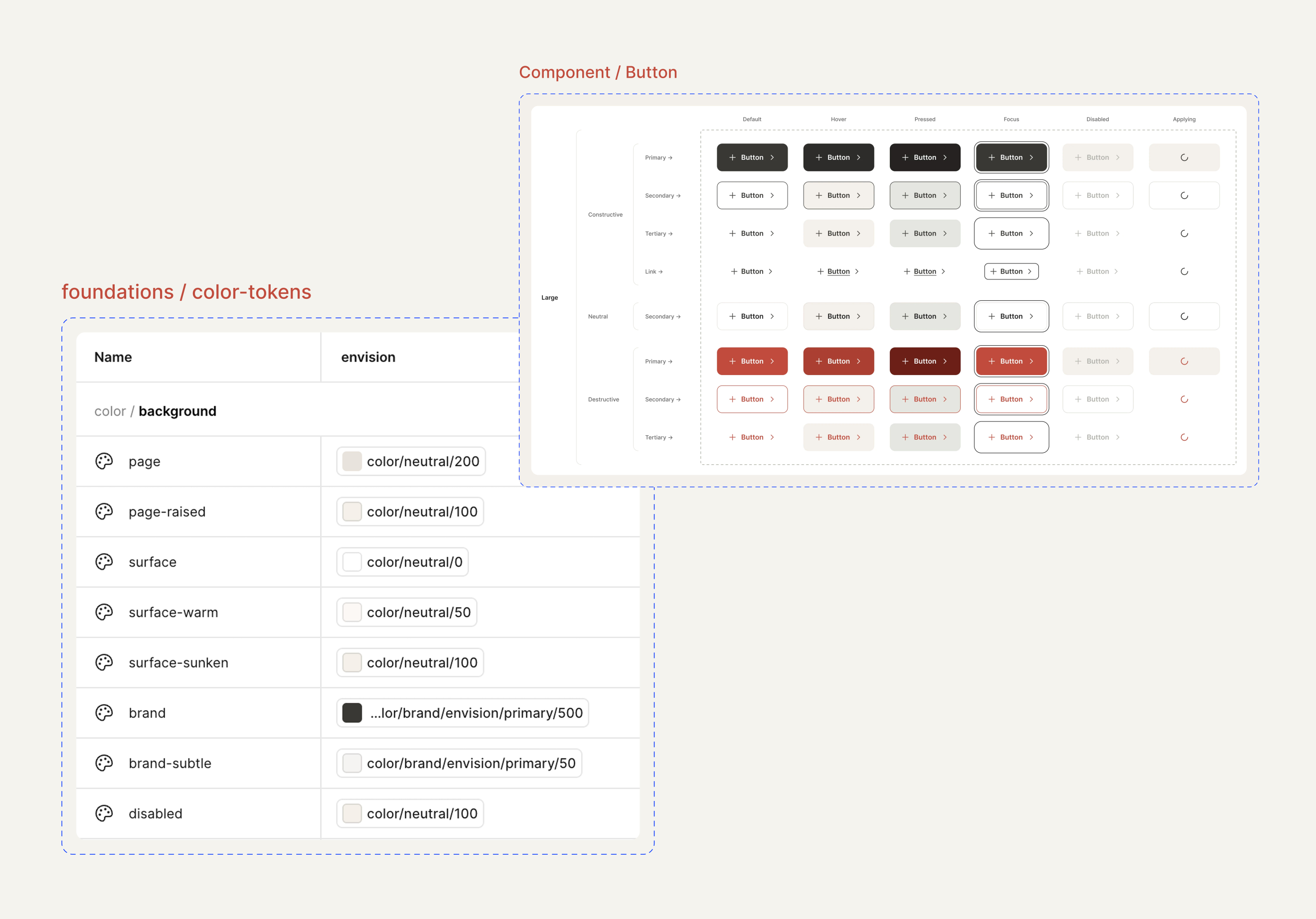
The objective
Building a scalable component library on a tokenized infrastructure for a white-label product, so an entire team could contribute safely.
Overview
Envision is a virtual design center where homeowners can customize their new home through an interactive 3D experience. I built a machine-ready design system that could adapt to different homebuilder brands. It needed to keep design and development aligned and give developers a reliable source of documentation.
I built a three-tier token architecture and connected Figma to code through Style Dictionary. I developed a reusable component library supported by Storybook documentation and a dedicated Developer Center that established guidelines for implementation and maintenance.
The result demonstrates how a machine-ready design system can support multiple brands and scale across products.
View websiteContext and my role
I owned the design system from the start, making the architectural decisions and carrying the work through implementation. I established a three-tier token structure that could support multiple brands through shared components. I also defined what belonged in the component library and built the pipeline connecting Figma to code. To support future contributions, I created the governance model and documentation that would keep the system consistent as it grew.
Decision 1
Three tiers of tokens
The system is built on a three-tier token architecture that separates raw values from how they're used in the interface. I established this structure early to keep tokens organized and reusable without making the system difficult to maintain as it grows.
-
Tier 1
Definitions
These are the raw ingredients of the system. Color ramps, typography values, spacing and border properties live here. They have no intended UI role and simply define what is available.
color/green/500
-
Tier 2
Semantic
Semantic tokens assign meaning to raw values, describing how they should be used rather than what they are. They connect those values to specific UI roles and support white-label theming across brands.
color/background/brand
-
Tier 3
Component
Component tokens control properties specific to individual components. They reference semantic tokens or primitives as needed to manage variants and states without affecting the rest of the system.
button/primary/color/background/hover
I built theming into the architecture so the same component library can support multiple brands. Each theme defines its own visual identity, which the components inherit. This makes changes predictable across the system.


Decision 2
A naming system built around intent
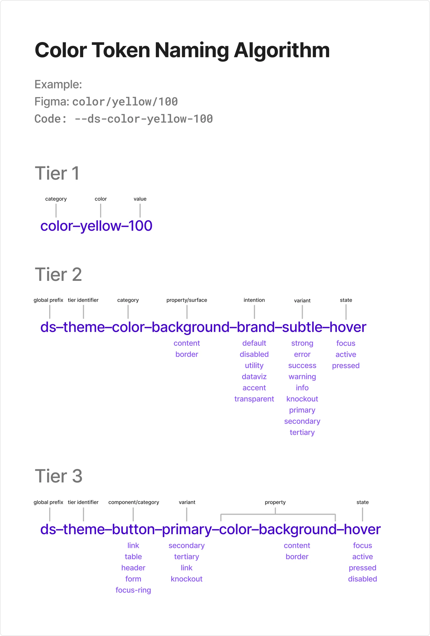
A design system needs a shared language that designers and developers can understand. I established a naming convention based on each token's purpose, with a predictable structure that carries from Figma into code.
I established a consistent naming structure across all three token tiers. Each name follows a predictable order from broad to specific. The color examples below break down that structure and show the possible values for each part.
Why it matters
Naming is part of how a design system works. A predictable structure helps designers find the right tokens and developers understand how they're used. It also gives AI tools explicit rules to follow when working with the system.
As more people contribute, that shared language helps keep the system consistent.
Decision 3
Connecting design directly to code
The values defined in Figma variables had to be the same ones used in the product, so I built a pipeline that turns design tokens into assets the application can use. Figma variables are exported into JSON and processed through Style Dictionary to generate CSS variables and TypeScript files. These outputs are committed to the codebase and reviewed by the dev team.
- Figma Variables
- JSON
- Style Dictionary
- CSS / TypeScript
- Components
- Product

Storybook
I built Storybook using the actual components, with interactive examples showing their different states and how they behave. The library includes 66 stories across 14 components, with automated tests to check functionality and accessibility.
View StorybookDecision 4
Governance built into the system
The Envision Design Center gives designers and developers one place to understand the system and how to contribute. It covers foundations, component usage and guidelines for managing changes. Storybook shows how components work, while the Design Center explains how to use them and keep the system consistent as it grows.
 View Documentation
Tracking changes and releases
I built component changelogs to document updates and make release history easy to follow. Changes are classified as Major, Minor or Patch, with migration guidance for breaking changes.
I also created an Add Change workflow that captures proposed updates and generates a ticket for review. Changes are documented before they're introduced into the system.

Accessibility as a default, not a final check
I made accessibility part of the system from the start, including keyboard navigation, screen reader support and color contrast. Automated tests caught issues in the Right Rail and Option Card that weren't obvious in the designs. I also improved inactive tab contrast from 3.5:1 to 7.5:1. Fixing these issues in the components means they don't have to be addressed every time they're used.
Results
The system in use
I applied the design system across Envision's homeowner portal and 3D Design Center, bringing the components together into complete product experiences.
A persistent configuration rail
The Right Rail is a composite component built from smaller, reusable components. Each component maintains its own states and behavior which allows them to be reused independently. The same structure adapts from a desktop side panel to a bottom sheet or drawer on mobile.

Package and material selection
Package Cards combine media, pricing, descriptions and material selections. Configurable properties control elements like the Popular badge. The footer automatically adjusts swatch sizes and spacing based on the number of finishes available.

Impact
Envision now has a working design system with the architecture, components and processes in place to scale across multiple brands and products. I connected design directly to code and established clear standards for how the system can be maintained and extended by other teams.
- Three-tier token architecture supporting multiple homebuilder themes.
- Automated Figma-to-code pipeline generating CSS and TypeScript tokens.
- 14 working Web Components with React adapters and 66 Storybook stories.
- Design system documentation covering components, accessibility and governance.
- Machine-readable specifications supporting AI-assisted development.